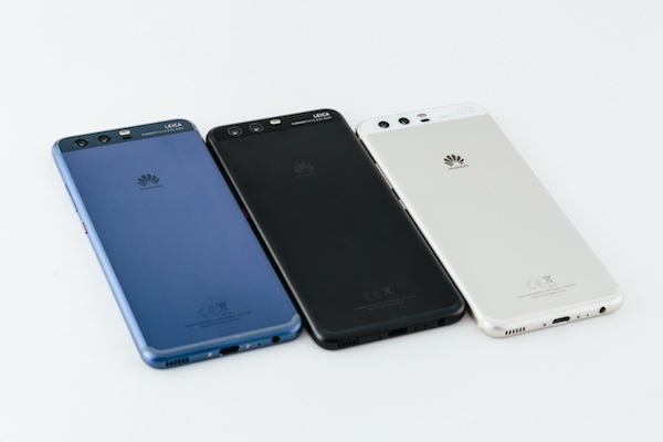
When smartphones first came of age in the mid-2000s, techies probably resigned themselves for a future of futuristic looking mobiles. To communicate quality and stature, these devices were virtual clones, with sleek surfaces of glass, metal or plastic, presented in monochromatic shades. Fast forward to today however, colours are making a comeback in a big way!
Whether it was to break the sheer monotony of black and white or the realisation that premium customers also appreciate a pop of colour in their favourite devices, manufacturers have made waves by introducing colours as part of their smartphone’s design language – though initially in relatively muted shades; soft pinks and pale golds come to mind.
And then along came HUAWEI.
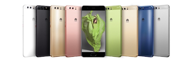
P10 – 8 Eye-popping Colours
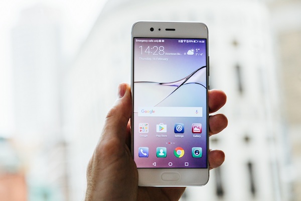
HUAWEI’s P10 series has certainly proven itself to be the bellwether in how beauty and performance are not mutually exclusive in smartphones. In addition to sporting a game-changing dual camera setup co-engineered with Leica, HUAWEI’s flagship series has also been updated with an array of eye popping colours.
Two of these in particular (Dazzling Blue and Greenery) are a standout, in that they were developed collaboratively with yet another industry giant – the Pantone Colour Institute. Matched with specific wallpapers created to complement the handset’s body, HUAWEI’s P10 puts paid to an unspoken convention that style and quality has to be understated.
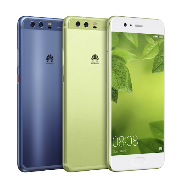
Shades of Greenery
Making colours a prominent part of a smartphone’s design language helps to elevate the device’s purpose, which is to communicate. Specifically, Greenery (Pantone’s colour of the year for 2017) was selected to communicate its users need “to revitalise and renew” – recalling the experience of restoring and replenishing yourself by reconnecting with the beauty of the natural world.
HUAWEI is always looking to elevate customer experience with its devices – be it through industry defining camera photography or superior user performance. It stands to reason that we would also look to redefining the design language of today’s smartphones in order to better improve our customer’s experience with our products. HUAWEI’s collaboration with the Pantone Colour Institute underscores this very commitment and is confident that colours will come to be one of the few key critical factors that will help influence a smartphone user’s purchase decision.
Elevating Smartphone Design to New Artistic Heights
Since its launch earlier this year, the P10 series has outperformed its predecessor in terms of sales (shifting twice the sales volume in half the time compared to the P9 series last year in Malaysia alone). While credited mostly to the enthusiastic response to its dual camera co-engineered with Leica – Leica Dual-Camera 2.0 and Leica Dual-Camera 2.0 Pro Edition, the introduction of colours to HUAWEI’s flagship series may yet see uptake for the P10 series soar to even greater heights.
For more information on HUAWEI’s flagship P series and other cool innovations, please visit: http://consumer.huawei.com or HUAWEI’s official Facebook page www.facebook.com/HuaweiMobileMY.
 Selebriti Online Portal Infotainment
